Colors in Balance: Creating Harmony Between the Subtle and the Bold


Colors in Balance: Creating Harmony Between the Subtle and the Bold
Colors influence us more than we often realize. They can calm or energize, warm or cool, and they can transform the mood of a room or an outfit in an instant. But how do you find the right balance between the subtle and the bold? How do you make sure your colors complement rather than compete? Here’s how to create harmony in your home and wardrobe by working consciously with color relationships.
Understanding the Character of Colors
Every color has its own personality. Some are quiet and understated, others are lively and expressive. When you understand their basic qualities, it becomes easier to combine them with confidence.
- Neutral colors like gray, beige, white, and black create a calm foundation. They act as a backdrop for more vibrant tones.
- Warm colors such as red, orange, and yellow bring energy and warmth. They tend to advance visually and draw attention.
- Cool colors like blue, green, and violet evoke calm and depth. They often recede, helping to balance stronger hues.
When combining colors, the goal is to let them interact rather than compete. A bold color gains strength and clarity when placed next to something more subdued.
Creating Balance at Home
In interior design, color sets the tone of a space. A good rule of thumb is to choose one dominant color, one secondary color, and one accent color. The dominant color defines the atmosphere, the secondary supports it, and the accent adds life.
- In the living room, soft neutrals on the walls can create a serene backdrop. Add color through pillows, throws, or artwork. A single bold hue—like deep green or burnt orange—can give the room character without overwhelming it.
- In the kitchen, color can energize. A painted accent wall or a collection of colorful ceramics can bring warmth and personality to a simple space.
- In the bedroom, calm tones usually work best. Subtle details—like a quilt, lamp, or framed print—can introduce gentle color variation while keeping the space restful.
A helpful trick is to look to nature for inspiration. Think of how colors in a landscape balance each other: the green of trees against a blue sky, golden fields beside gray stone. Nature’s palette is rarely random—and it almost always works.
Læs også:


Color in Your Wardrobe
When it comes to clothing, color balance is about both personality and context. Some days you want to stand out; other days you prefer to blend in. It’s not about choosing one approach over the other, but about moving fluidly between them.
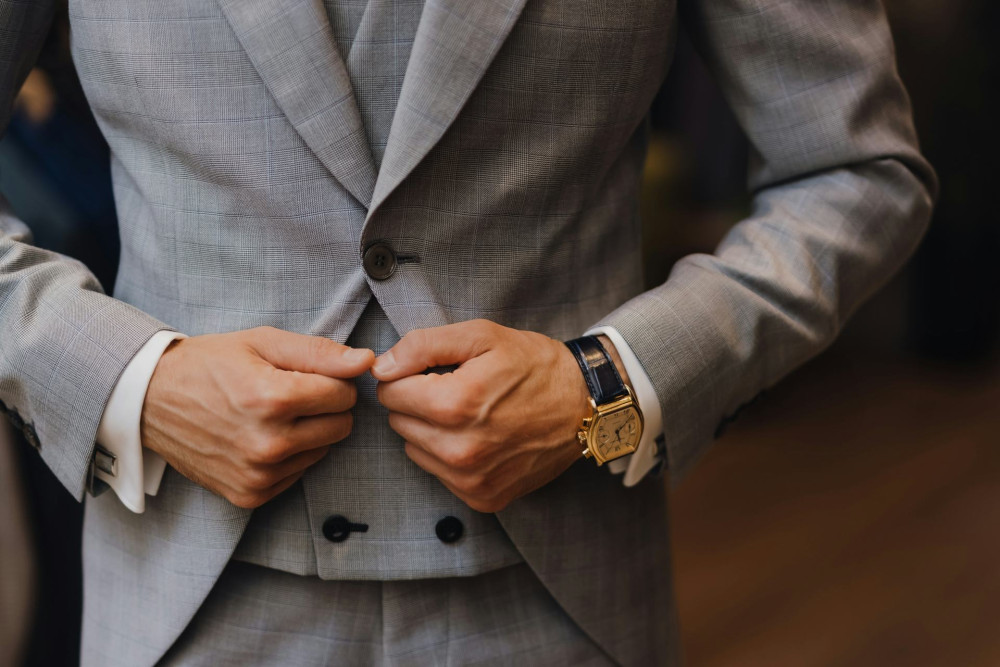
- The subtle look: Neutrals like sand, navy, and gray create a timeless, versatile base. They mix easily and provide a canvas for bolder accents.
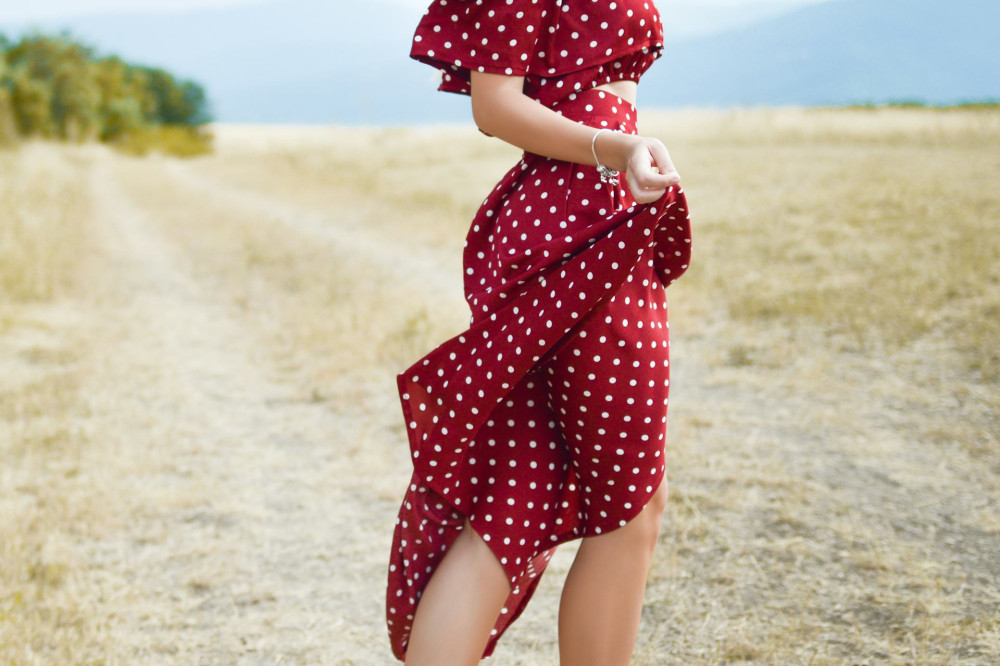
- The bold look: A strong color—like cobalt blue, mustard yellow, or wine red—can elevate an entire outfit. Use it in a jacket, scarf, or pair of shoes, and keep the rest understated.
- The balance: Try pairing one bold color with two neutrals. This creates harmony, allowing the color to shine without dominating.
If you’re unsure, check your outfit in natural light. Colors shift with lighting, and what looks warm in a store might feel cooler at home. Trust your instincts—and remember that color is as much about emotion as it is about appearance.
Color and Personality
Color is a way to express who you are and how you feel. Some people feel most comfortable in muted tones, while others thrive in strong contrasts. There are no right or wrong choices—only what feels authentic to you.
If you usually play it safe, experiment with small pops of color: a bright nail polish, a patterned scarf, or a colorful throw pillow. These small touches can refresh your look without changing your entire style.
If you love color, you can create more calm by introducing neutral elements that tie everything together. The goal is to find that point of balance where you feel both inspired and at ease.
When Color Brings Calm
In a world filled with visual noise, thoughtful use of color can be a way to create peace. A harmonious palette can make a room feel more cohesive—and an outfit appear effortlessly put together.
Working with color is ultimately about balance—between the subtle and the bold, between energy and calm, between what is seen and what is felt. When you find that balance, a natural harmony emerges—one that both the eye and the mind can rest in.
Læs også: